Converting a Figma pricing page to HTML usually involves rebuilding pricing cards, feature lists, FAQ sections, and call-to-action blocks by hand. In this example, I tested how EspritCode handles a real pricing page design and compared the generated HTML with the original Figma file.
After publishing my previous example converting a landing page from Figma to HTML with EspritCode, I wanted to test how the tool handles a different page type. So this time, I built a pricing page in Figma and ran it through EspritCode to see the result.
Pricing pages are a common deliverable for freelance landing page work. They have a different structure than typical landing pages — multiple cards in a row, a FAQ section, repeated elements — so they’re a good test of whether a Figma to code tool can handle production-realistic layouts.
This article shares the actual before and after, with the generated code snippets included.
The Figma Design
The pricing page has four sections: a hero, three pricing cards (Free, Pro, Agency), a FAQ section with four questions, and a call-to-action block at the bottom. The whole thing uses Figma’s Auto Layout throughout, which matters for systematic conversion.
Here’s the full Figma design:
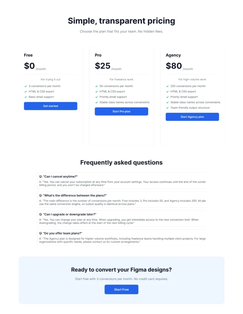
The pricing cards use a fairly common pattern: plan name, price, short description, divider, feature list with checkmarks, and a call-to-action button. The middle card (Pro) gets a “Most Popular” badge and a filled button to visually emphasize it.
The Conversion Process
Same workflow as before: paste the Figma URL into EspritCode, wait a few seconds, download the generated HTML and CSS. No prompting, no parameters to tune — just paste and convert.
The conversion finished in well under a minute.
If you’d like to see a simpler example first, check out our Landing Page conversion example.
Why Pricing Pages Are a Good Test Case
Pricing pages are particularly useful for evaluating Figma to HTML tools because they combine multiple patterns that show up across many landing page projects: repeated card components, Auto Layout containers nested several levels deep, content-heavy sections like FAQs, and conversion-focused CTA blocks.
If a tool can handle a pricing page cleanly, it’ll usually handle most other landing page sections too. If it struggles with the card repetition or the FAQ stack, that’s a signal worth catching early.
The Result
Here’s the converted HTML rendered in the browser:
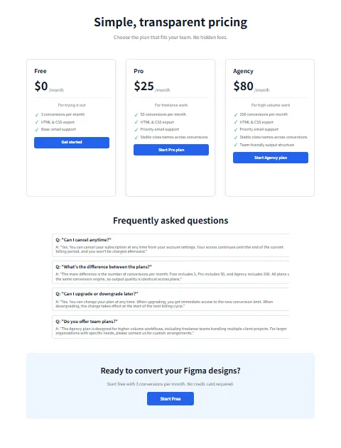
Comparing the two side by side, the structure stays consistent: the three cards remain in a row, the FAQ items stack vertically, and the CTA block at the bottom keeps its centered layout. Spacing, typography, and section organization all carry over.
A Look at the Generated Code
Here’s how EspritCode structures the Free pricing card in the output:
<div class="figma-Card-Free-26-173">
  <h2 class="figma-Free-25-147">
    Free
  </h2>
  <div class="figma-Price-Group-25-148">
    <h1 class="figma-0-25-149">$0</h1>
    <p class="figma-month-25-150">/month</p>
  </div>
  <p class="figma-For-trying-it-out-25-152">
    For trying it out
  </p>
  <div class="figma-Features-List-25-153">
    <div class="figma-Feature-Item-1-25-154">
      <h3>✓</h3>
      <p>3 conversions per month</p>
    </div>
    ...
  </div>
  <div class="figma-CTA-Button-25-157">
    <p class="figma-Get-started-25-158">Get started</p>
  </div>
</div>
A few observations:
- Class names follow the Figma layer naming. The “figma-” prefix combined with layer names like “Card-Free” and Figma node IDs (like 26-173) keeps the output traceable back to the source design. You can locate any element in Figma by matching the ID in the class name.
- The card structure is nested. Card → Price Group → Features List → Feature Item — the Figma frame hierarchy maps directly to the HTML structure. Auto Layout frames become Flexbox containers.
- Heading levels are inferred from typography. “Free” became an h2, “$0” became an h1, and feature descriptions stayed as paragraphs. This is based on font size and weight, not a manual choice, so the semantic hierarchy may need adjusting depending on context.
Here’s the CSS for the same card:
.figma-Card-Free-26-173 {
  position: relative;
  display: flex;
  flex-direction: column;
  align-items: flex-start;
  gap: 20px;
  padding: 32px;
  width: 380px;
  height: 580px;
  background-color: rgba(255, 255, 255, 1);
  border-radius: 12px;
  border: 1px solid rgba(229, 231, 235, 1);
}
The card uses Flexbox with column direction — because the Figma frame had Auto Layout set to vertical. (For more on this mapping, see our Auto Layout to CSS Flexbox guide.)
What Worked Well
A few things that came out cleanly:
- The FAQ section converted accurately. Each FAQ item became a self-contained div with question and answer, stacked in a Flexbox column.
- The CTA block at the bottom kept its layout. The centered text and button alignment translated correctly from Figma’s Auto Layout to CSS Flexbox center.
- Pricing card consistency. All three cards have the same internal structure, so updates to one (in Figma) would naturally apply to the others.
Things to Refine After Conversion
The output isn’t a finished deliverable. A few things you’d typically refine before shipping to a client:
- Semantic tags. Wrapping the pricing section in
<section>, the FAQ in a list, and using<button>for actions would improve accessibility. - Responsive behavior. The output uses absolute pixel values matching the Figma frame. Adding media queries for tablet and mobile is a manual step.
- Heading hierarchy. Because EspritCode infers heading levels from typography, the result may have multiple h1s on the page. You’d typically consolidate these manually.
- Class names. Renaming “figma-Card-Free-26-173” to something like “pricing-card pricing-card–free” makes the CSS more readable for future maintenance.
None of these are dealbreakers — they’re the kind of cleanup that’s always needed when starting from an auto-generated baseline. The point is that you start from working, structured HTML instead of from scratch.
The Bigger Picture for Freelance Work
Pricing pages are a small but recurring part of freelance landing page work. A typical project might include a homepage, an about page, a pricing page, and a contact page — and the pricing page often needs the most iteration as clients adjust their plans, copy, and CTAs.
Because they combine repeated components, nested Auto Layout containers, and content-heavy sections like FAQs, pricing pages are also a useful benchmark when evaluating Figma to HTML tools. A tool that produces clean, structured output here is more likely to handle the rest of a typical landing page project.
For this kind of work, the value of deterministic conversion is that revisions stay manageable. When the client says “let’s change the Pro plan from $25 to $29 and add another feature,” you update the Figma, re-convert, and the class structure stays consistent. You don’t have to reconcile changes against a regenerated codebase.
Try It Yourself
If you’re curious how EspritCode handles your own pricing page or landing page designs, the Free plan includes 3 conversions per month — no credit card required. Drop in a real client design and see what the output looks like for your workflow.