
Converting a Figma SaaS dashboard to HTML usually involves rebuilding sidebars, KPI cards, charts, tables, and action buttons by hand. In this example, I tested how EspritCode handles a real admin dashboard design and compared the generated HTML with the original Figma file.
This is the third article in my Figma-to-HTML conversion series. After covering a landing page and a pricing page, I wanted to try something with more layout complexity. SaaS dashboards combine sidebars, top headers, KPI cards, charts, and tables — each with their own nesting and Auto Layout structure — so they’re a strong test of whether a Figma-to-code tool can handle realistic admin UI work.
This article shares the actual before and after, with the generated code snippets included.
The Figma Design
The dashboard has five main areas: a left sidebar with navigation, a top header with search and an action button, a page header, three KPI cards, a chart section with filter buttons, and a recent activity table with status badges. Auto Layout is used throughout — including nested layouts inside cards and table rows.
Here’s the full Figma design:
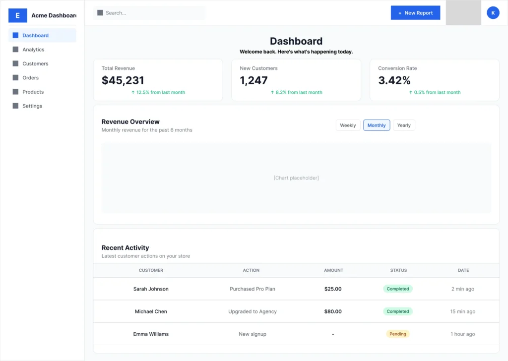
The dashboard layout is intentionally typical: it’s the kind of admin UI you’d see in any SaaS product. Sidebar navigation on the left, content on the right, with KPI cards at the top and a data table at the bottom. The Pro card pattern from the pricing page reappears here as KPI cards, but with different content and proportions.
The Conversion Process
Same workflow as the previous examples: paste the Figma URL into EspritCode, wait a few seconds, download the generated HTML and CSS. No prompting, no parameters to tune — just paste and convert.
The conversion finished in well under a minute.
If you’d like to see simpler examples first, see our Landing Page conversion example or the Pricing Page conversion example.
Why Dashboards Are a Good Test Case
Dashboards are particularly useful for evaluating Figma-to-HTML tools because they combine several patterns that don’t usually appear together in a single page:
- A fixed-width sidebar with repeated menu items
- A top header with mixed content (search input, action button, icons)
- Repeated card components (KPIs) in a row
- Filter button groups with active/inactive states
- A data table with column headers and repeating rows
- Small UI elements like status badges with different color states
If a tool can handle these together, it’ll usually handle most other SaaS UI work too.
The Result
Here’s the converted HTML rendered in the browser:
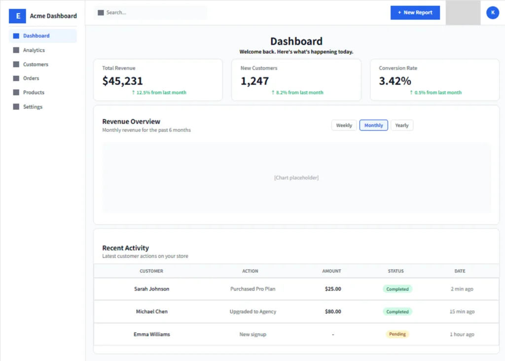
Comparing the two, the structure stays consistent: the sidebar holds its width on the left, the KPI cards stay in a row at the top, the chart section keeps its filter buttons aligned right, and the table preserves its column structure with status badges intact.
A Look at the Generated Code
The most interesting parts to look at are the small repeated components. Here’s how EspritCode handles the “+ New Report” action button in the top header:
<div class="figma-New-Report-Button-16-79">
  <p class="figma--16-80">+</p>
  <p class="figma-New-Report-16-81">New Report</p>
</div>
And the matching CSS:
.figma-New-Report-Button-16-79 {
  position: relative;
  display: flex;
  flex-direction: row;
  align-items: center;
  justify-content: center;
  gap: 8px;
  padding: 10px 16px;
  width: 140px;
  height: 40px;
  background-color: rgba(37, 99, 235, 1);
  border-radius: 8px;
}
The Auto Layout inside the button (with the “+” symbol and label separated by an 8px gap) translates directly to Flexbox with gap: 8px. Padding, background color, and border radius all carry over. (For more on how Auto Layout maps to CSS, see our Auto Layout to CSS Flexbox guide.)
The status badges in the table follow the same pattern. Here’s the “Completed” badge:
<div class="figma-Status-Badge-Completed-31-152">
  <p class="figma-Completed-32-156">Completed</p>
</div>
.figma-Status-Badge-Completed-31-152 {
display: flex;
flex-direction: row;
align-items: center;
justify-content: center;
padding: 4px 10px;
width: fit-content;
background-color: rgba(209, 250, 229, 1);
border-radius: 12px;
}A few observations on the broader output:
- Class names trace back to Figma. Names like “figma-New-Report-Button-16-79” combine the layer name with Figma node IDs, so you can locate any element in the source design from the HTML class.
- Nested Auto Layout becomes nested Flexbox. The table row contains cell frames, which contain text or status badges. Each layer of nesting in Figma becomes a corresponding Flexbox container in the output.
- Heading levels are inferred from typography. “Dashboard” became an h2, KPI values became h2, and section titles became h3. As before, this is based on font size and weight, not a manual choice — so the heading hierarchy may need adjustment depending on context.
- Icons appear as image references. Where the Figma design used filled rectangles as placeholders for icons, those came through as
<img>tags pointing to Figma’s image API. In a real project you’d typically replace these with actual icon components.
What Worked Well
- The sidebar layout converted accurately. The active “Dashboard” menu item retained its blue background and text color, while the inactive items kept their neutral styling.
- KPI cards translated cleanly. Three cards in a row, each with their internal vertical layout (label → number → change indicator) preserved as nested Flexbox.
- Status badges worked as designed. Both the green “Completed” and yellow “Pending” badges came through with their correct background colors, text colors, padding, and border radius. The two variants differ only in color, which is exactly what you’d expect from a design system.
- The table structure held together. Column headers, three data rows, and the row dividers all kept their alignment.
Things to Refine After Conversion
As with previous examples, the output isn’t a finished deliverable. A few things you’d refine before shipping:
- Semantic tags. Wrapping the sidebar in
<aside>, the table in proper<table>/<thead>/<tbody>tags, and the action button in<button>would improve accessibility considerably. - Responsive behavior. Dashboards usually need significant tablet and mobile treatment — collapsible sidebar, stackable KPI cards, scrollable tables. None of that is generated automatically; it’s manual work after conversion.
- Icon replacement. The placeholder rectangles for icons should be swapped for actual icon components (Heroicons, Lucide, or custom SVG).
- Class name refactoring. Renaming the figma- prefixed classes to something like
dashboard__sidebarorkpi-cardmakes the CSS easier to maintain long-term. - Chart implementation. The chart area is a placeholder. Wiring in a real chart library (Chart.js, Recharts, etc.) is a separate task.
None of these are dealbreakers. The point is that you start from a working, structured baseline instead of from scratch.
The Bigger Picture for SaaS UI Work
SaaS dashboards and admin panels are a frequent part of both freelance landing page work and product UI development. A typical SaaS project might include a marketing site, a pricing page, and an admin dashboard — and the admin dashboard often goes through the most iteration as the product evolves.
Because dashboard UI typically combines nested Auto Layout, repeated components, and content-heavy tables, it’s a good benchmark for any Figma-to-HTML tool. A tool that produces clean, structured output on a SaaS dashboard is likely to handle the rest of a typical SaaS project too.
For this kind of work, deterministic conversion means that as the dashboard evolves — new KPI cards, new menu items, additional table columns — the class structure stays consistent across regenerations. You don’t have to reconcile changes against a regenerated codebase each time.
Try It Yourself
Want to test your own SaaS dashboard or admin UI? The Free plan includes 3 conversions per month — no credit card required — so you can compare your original Figma file with the generated HTML before committing to anything. Drop in a real design and see what the output looks like for your workflow.