
Converting a multi-section freelancer landing page from Figma to HTML usually means manually rebuilding a navigation bar, hero section, trust indicators, service cards, project portfolio, client testimonials, pricing cards, an FAQ accordion, and a final call-to-action — all from scratch. In this example, I tested how EspritCode handles a full freelancer LP design and reviewed the generated HTML and CSS against the original Figma file.
This is the tenth article in my Figma-to-HTML conversion series. So far, I’ve covered individual UI patterns like dashboards, kanban boards, data tables, and pricing comparison tables. For this example, I wanted to return to a complete landing page — but one specifically designed for the kind of freelance web developer who builds client sites from Figma designs. The goal was to test how EspritCode handles a realistic, multi-section LP with a variety of layout patterns in a single file.
This article shares the actual before and after, with real code snippets from the generated output.
The Figma Design
The design is a 1440px wide, full-length freelancer landing page with ten sections: a sticky navigation bar, a two-column hero with a headline and image placeholder, a “Trusted By” logo strip, a three-card services section, a three-card portfolio section, a three-card testimonials section, a three-plan pricing section, a five-item FAQ list, a dark final CTA section, and a footer. Auto Layout is used throughout every section.
Here’s the full Figma design:
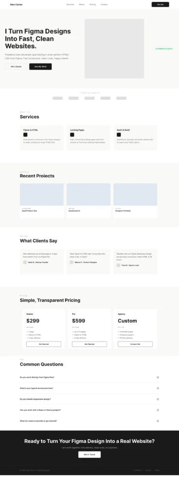
The design alternates between a white background and a warm off-white (#F9F9F7) to create visual rhythm between sections. The navigation, hero, and final CTA use dark and neutral tones, while the content sections stay light throughout. The pricing section highlights the Pro plan with a dark background, following the same pattern as the pricing comparison table from a previous article in this series.
The Conversion Process
The workflow is the same as in previous examples: paste the Figma URL into EspritCode, wait a few seconds, then download the generated HTML and CSS. No prompting or parameter tuning is required.
The conversion finished in well under a minute.
If you’d like to see other examples first, see the Landing Page, Pricing Page, SaaS Dashboard, Kanban Board, or Data Table conversion examples.
Why a Freelancer Landing Page Is a Useful Test Case
A multi-section landing page is one of the most complete tests of a Figma-to-HTML tool because it combines almost every layout pattern in a single file:
- A two-column hero with a text block and an image placeholder side by side
- A horizontal logo strip using repeated rectangle placeholders
- Three-column card grids that repeat across services, portfolio, and testimonials sections
- A pricing section with three plan cards including a dark highlighted plan
- A FAQ list with five items, each containing a question and an icon
- A full-width dark CTA section and a two-column footer
In addition, the alternating section backgrounds require the tool to correctly apply different background colors across ten consecutive frames. For example, if a tool incorrectly flattens section backgrounds, the visual rhythm of the page breaks immediately.
The Result
Here’s the converted HTML rendered in the browser:
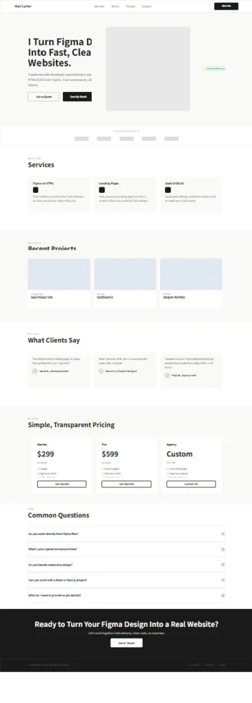
Comparing the two, the section structure is preserved throughout: the navigation sits at the top, the hero shows the two-column layout with the image on the right, the logo strip appears below, and the services, portfolio, testimonials, pricing, FAQ, CTA, and footer follow in the correct order. The alternating section backgrounds carry through correctly, and the dark Pro pricing card and dark final CTA section both render with their intended contrast.
A Look at the Generated Code
The most interesting part to examine is how the repeated card components are handled across different sections. Here’s the HTML for the first service card:
<div class="figma-ServiceCard-1-5-38">
  <p class="figma-ServiceCard-1-Title-5-40">Figma to HTML</p>
  <img class="figma-ServiceCard-1-Icon-5-39" alt="ServiceCard-1-Icon" />
  <p class="figma-ServiceCard-1-Desc-5-41">
    Pixel-perfect conversion from Figma designs to clean, production-ready HTML/CSS.
  </p>
</div>
And here’s the first pricing card (Starter plan):
<div class="figma-PricingCard-Starter-36-34">
  <p class="figma-Starter-Name-33-24">Starter</p>
  <h2 class="figma-Starter-Price-33-25">$299</h2>
  <p class="figma-Starter-PriceSub-33-26">per page</p>
  <div class="figma-Starter-Features-33-28">
    <p class="figma-Starter-Feature-1-33-29">✓ 1 page</p>
    <p class="figma-Starter-Feature-2-33-30">✓ Figma to HTML</p>
    <p class="figma-Starter-Feature-3-33-31">✓ 3-day delivery</p>
  </div>
  <div class="figma-Starter-CTA-33-32">
    <p class="figma-Starter-CTA-Label-33-33">Get Started</p>
  </div>
</div>
A few observations on the broader output:
- Heading levels are inferred from typography across the full page. The hero title and the final CTA title were both output as
<h1>, while section titles (Services, Recent Projects, What Clients Say, and so on) were output as<h2>. This reflects the font size and weight hierarchy in the Figma design. In production, having two<h1>elements on a single page would need to be corrected for SEO. - Small rectangles are consistently output as images. The logo placeholders in the Trusted By strip, the service card icons, the portfolio thumbnails, the testimonial avatars, and the FAQ toggle icons all came through as
<img>tags referencing Figma’s S3 API. This is consistent with the pattern observed throughout this conversion series. - The three pricing plans converted with correct content. After updating the Figma component instances, each plan — Starter ($299), Pro ($599), and Agency (Custom / Contact Me) — rendered with its correct name, price, features, and CTA label.
- Alternating section backgrounds converted correctly. The white and off-white (#F9F9F7) backgrounds alternate correctly across all ten sections without any color bleed between them.
What Worked Well
- The ten-section structure converted in order. All sections from navigation through footer are present and correctly sequenced in the output, with each section’s background color, padding, and child elements preserved.
- Three-column card grids are consistent across sections. The services, portfolio, and testimonials sections each use a three-card grid, and all three converted with consistent card structure and correct content.
- The dark Pro pricing card rendered correctly. The dark background (#1A1A1A), white text, and white CTA button of the Pro plan card all came through accurately, matching the highlighted plan pattern from the pricing comparison table article.
- The FAQ item structure is consistent across all five items. Each FAQ row contains the question text and an icon placeholder, and all five items follow the same HTML structure with correct content per item.
Things to Refine After Conversion
As with previous examples, the output is a structured starting point rather than a finished deliverable. Here are the main things to address before shipping:
- Fix text clipping in the hero section. The hero headline and the “Available for projects” badge show clipped text in the rendered output. This happens when a Figma text frame is set to a fixed size smaller than the content it contains — the CSS inherits that fixed width, causing the overflow to be hidden. The fix is to remove the fixed width from the affected CSS classes or set them to auto. This is standard cleanup after conversion from fixed-size Figma frames.
- Correct the h1 duplication. Both the hero title and the final CTA title were inferred as
<h1>based on font size. For SEO, a page should have a single<h1>. The final CTA title would typically be demoted to an<h2>or styled<p>. - Replace image placeholders with real content. Logo placeholders, service icons, portfolio thumbnails, testimonial avatars, and FAQ toggle icons are all
<img>tags. In a real freelancer site, these would be replaced with actual client logos, icon SVGs, project screenshots, headshot photos, and interactive accordion toggles. - Add FAQ interactivity. The FAQ items are static HTML rows. In production, these would typically be enhanced with JavaScript to show and hide answer text on click — a standard accordion pattern.
- Semantic tags and accessibility. Navigation links are
<p>tags. Wrapping them in<nav>and<a>tags, and replacing CTA<div>elements with<button>or<a>tags, improves both accessibility and SEO. - Responsive behavior. The design is fixed at 1440px. In production, a freelancer landing page typically needs tablet and mobile breakpoints — stacking two-column layouts vertically, collapsing the navigation, and adjusting typography sizes.
None of these are specific to EspritCode. They represent the standard gap between a static Figma design and a production-ready website.
Freelancer Landing Pages in Practice
Freelancer and agency landing pages are one of the most common deliverables in web development work — and also one of the most repetitive to build. The structure is almost always the same: hero, social proof, services, portfolio, testimonials, pricing, FAQ, CTA. A tool that can convert a Figma LP design to a structured HTML baseline handles the most frequent use case for anyone doing client web work.
Moreover, this is exactly the kind of page that benefits most from a deterministic conversion approach. Because the sections are independent and self-contained, each section can be updated in Figma and reconverted individually. A client asking to update the pricing plan names, add a new portfolio card, or change the FAQ items can have their Figma file updated and the relevant section reconverted — without touching the rest of the page.
For freelancers using EspritCode in their own workflow, this also means the tool they use to build client sites can produce a baseline for their own personal site using the same Figma-to-HTML process.
Try It Yourself
Want to test your own landing page or freelancer site design? The Free plan includes 3 conversions per month — no credit card required. Don’t have a Figma file yet? After signing up, you can use EspritCode’s sample files — a Dashboard and a Portfolio design — to run your first conversion right away.