
Converting a kanban board from Figma to HTML usually means manually rebuilding four columns, repeated card components, color-coded tags, avatar placeholders, and column headers with status indicators. In this example, I tested how EspritCode handles a realistic project management UI and reviewed the generated HTML and CSS against the original Figma file.
This is the seventh article in my Figma-to-HTML conversion series. So far, I’ve covered a landing page, pricing page, SaaS dashboard, portfolio site, login page, and settings page. For this example, I wanted to test something with a high degree of component repetition: a kanban board. Kanban boards are interesting because the same card component repeats across multiple columns, each with slightly different tag colors and content. As a result, they’re a strong test of how consistently a conversion tool handles repeated components.
This article shares the actual before and after, with real code snippets from the generated output.
The Figma Design
The board uses a 1440 × 900px layout. At the top, a white header contains the board title (“Product Roadmap”), a subtitle (“Q3 2025”), and an “+ Add Task” button on the right. Below the header, four columns sit side by side: To Do, In Progress, Review, and Done. Each column has a header with a colored status dot and a card count badge, followed by task cards stacked vertically.
Each card contains a color-coded tag (Design, Backend, Frontend, or Research), a task title, a due date or completion label, and a circular avatar placeholder. The status dots use different colors per column — gray for To Do, blue for In Progress, amber for Review, and green for Done.
Here’s the full Figma design:
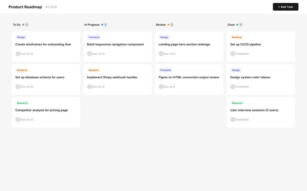
The design uses Figma components for the card structure, so each card across all four columns shares the same base layout — tag, title, footer with avatar and due date. Only the content and tag color differ between cards.
The Conversion Process
The workflow is the same as in previous examples: paste the Figma URL into EspritCode, wait a few seconds, then download the generated HTML and CSS. No prompting or parameter tuning is required.
The conversion finished in well under a minute.
If you’d like to see other examples first, see the Landing Page, Pricing Page, SaaS Dashboard, Portfolio Site, Login & Sign Up Page, or Settings Page conversion examples.
Why Kanban Boards Are a Useful Test Case
Kanban boards are worth testing separately from dashboards and settings pages because they introduce a specific challenge: high component repetition with per-instance variation. In practice, this means:
- The same card component repeats 10 times across four columns, each with different tag colors, titles, and due dates
- Each column header uses the same structure but a different status dot color
- Tag colors vary by category — purple for Design, orange for Backend, blue for Frontend, green for Research
- The Done column uses “Completed” instead of a due date, testing whether content variation within a repeated component carries through
- Avatar placeholders appear on every card, testing how circular image placeholders are handled
For example, if a tool handles component repetition inconsistently, you’d see class names or styles diverge between cards in different columns. Kanban boards make this pattern visible immediately.
The Result
Here’s the converted HTML rendered in the browser:
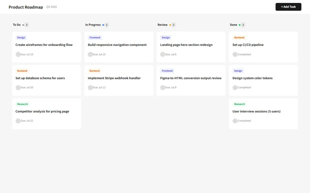
Comparing the two, the four-column layout holds together well. Each column renders its cards in the correct order, the tag colors carry through for all four categories, and the Done column correctly shows “Completed” instead of due dates. The header sits at the top with the board title, subtitle, and “+ Add Task” button in the correct positions.
A Look at the Generated Code
The most interesting part to examine is how the repeated card structure is handled. Here’s the HTML for the first card in the To Do column:
<div class="figma-Card-Todo-1-14-19">
  <div class="figma-Card-Todo-1-Tag-I14-19-8-23">
    <p class="figma-Card-Todo-1-Tag-Label-I14-19-8-24">Design</p>
  </div>
  <p class="figma-Card-Todo-1-Title-I14-19-8-25">
    Create wireframes for onboarding flow
  </p>
  <div class="figma-Card-Todo-1-Footer-I14-19-8-26">
    <img class="figma-Card-Todo-1-Avatar-I14-19-8-28" alt="Card-Todo-1-Avatar" />
    <p class="figma-Card-Todo-1-Due-I14-19-8-27">Due Jul 15</p>
  </div>
</div>
Each card across all columns follows this identical structure: tag container, title paragraph, and footer with avatar and due date. In addition, each card gets its own unique class names that encode both the card identity and the Figma node ID, so every element can be traced back to the source design.
Here’s how the column header is structured for the In Progress column:
<div class="figma-ColHeader-InProgress-I14-27-5-10">
  <div class="figma-ColTitle-IP-I14-27-5-18">
    <p class="figma-ColName-IP-I14-27-6-20">In Progress</p>
    <img class="figma-ColDot-IP-I14-27-6-21" alt="ColDot-IP" />
  </div>
  <div class="figma-ColCount-IP-I14-27-5-19">
    <p class="figma-ColCount-IP-Label-I14-27-6-22">2</p>
  </div>
</div>
A few observations on the broader output:
- Class names encode both component identity and Figma node IDs. Names like
figma-Card-Todo-1-Tag-I14-19-8-23include the card name, instance ID, and base component node ID. As a result, you can trace any element back to both the component instance and the base component in Figma. - Tag colors carry through per card. The Design tag uses a purple background and text color, Backend uses orange, Frontend uses blue, and Research uses green — all inherited correctly from the Figma layer fills without any manual adjustment.
- The Done column’s “Completed” label converted correctly. Even though all other cards use due dates, the Done column cards use “Completed” text, and this content variation came through accurately in the output.
- Circular avatar placeholders were output as images. The avatar rectangles with 12px border radius were output as
<img>tags referencing Figma’s S3 API, rather than as CSS-styled elements. In production, these would be replaced with actual user avatars or icon components. - Status dots were also output as images. Similarly, the small colored dot rectangles in each column header came through as
<img>tags. In production, these would be replaced with CSS-styled<span>elements.
What Worked Well
- The four-column layout converted correctly. All four columns render side by side with the correct widths and gaps, matching the Figma Auto Layout structure.
- Repeated card structure is consistent across columns. Every card follows the same HTML structure regardless of which column it belongs to, making the output straightforward to style and maintain.
- Tag color variants carried through accurately. Each tag category renders with its correct background and text color, with no color bleed between categories.
- Card count badges rendered correctly. Each column header shows the correct count — 3 for To Do, 2 for In Progress, 2 for Review, and 3 for Done — matching the Figma design.
Things to Refine After Conversion
As with previous examples, the output is a structured starting point rather than a finished deliverable. Here are the main things to address before shipping:
- Replace image dots with CSS. The status dot in each column header is currently an
<img>tag. Instead, a CSS-styled<span>withwidth,height,border-radius, andbackground-coloris cleaner and avoids unnecessary HTTP requests. - Replace avatar images with real content. The circular avatar placeholders are
<img>tags referencing Figma’s S3 API. In a real implementation, these would be replaced with user avatar images or initials-based components. - Add drag-and-drop behavior. The converted output is a static HTML representation. For a functional kanban board, drag-and-drop interactions — moving cards between columns — require JavaScript. Libraries like dnd-kit or react-beautiful-dnd handle this in a React context.
- Semantic tags. The “+ Add Task” button is currently a
<div>element. Replacing it with a<button>tag improves both accessibility and keyboard navigation. - Class name refactoring. The class names encode both component and instance IDs, which makes them verbose. Renaming to something like
kanban__cardorcolumn__headermakes the CSS easier to maintain.
None of these are specific to EspritCode. They’re the standard steps for turning a static Figma design into a functional project management UI.
Kanban Boards in SaaS and Freelance Work
Kanban boards appear in a wide range of SaaS products — project management tools, CRM pipelines, content calendars, and support ticket queues all use the same basic four-column pattern. Moreover, the component structure is almost always the same: a column header with a status indicator, followed by stacked cards with tags, titles, and metadata.
For freelance work, kanban UI is a common request when clients need a visual task tracking interface built into a dashboard or admin panel. In that context, starting from a structured HTML baseline — with correct column widths, card padding, and tag colors already in place — means the development work can focus on wiring in data and interactions rather than rebuilding layout from scratch.
The deterministic output is particularly useful for kanban layouts. Because the card structure is identical across all instances, reconverting after adding a new card type or tag category produces consistent class naming that’s easy to integrate with existing styles.
Try It Yourself
Don’t have a Figma file yet? After signing up, you can use EspritCode’s sample files — a Dashboard and a Portfolio design — to run your first conversion right away. Open the sample link from the convert screen, copy the URL, and paste it in.