
Converting a login and sign-up page from Figma to HTML usually means carefully reconstructing form fields, input states, labels, and button layouts by hand. In this example, I tested how EspritCode handles a two-panel authentication page design and reviewed the generated HTML and CSS against the original Figma file.
This is the fifth article in my Figma-to-HTML conversion series. After covering a landing page, a pricing page, a SaaS dashboard, and a portfolio site, I wanted to try a UI pattern that appears in almost every SaaS product: the login and sign-up page. Authentication pages have a distinct layout challenge — a split two-panel design with a branding panel on the left and a form panel on the right — and they include form elements that don’t appear in purely visual pages.
This article shares the actual before and after, with real code snippets from the generated output.
The Figma Design
The page uses a classic two-panel split layout at 1440 × 900px. The left panel is a dark branding area with a logo, headline, supporting copy, and a feature list. The right panel is a white form area with a title, three labeled input fields (Full Name, Email Address, Password), a submit button, a divider, and a sign-in link for returning users.
Here’s the full Figma design:
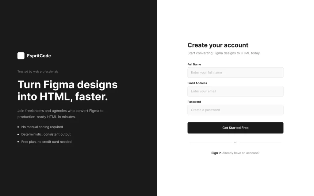
The split-panel layout is intentionally typical: it’s the kind of authentication UI you’d see in any SaaS product. Branding on the left to reinforce trust during sign-up, form on the right to keep the interaction focused. Auto Layout is used throughout — the left panel stacks the logo and content block vertically, while the form panel centers the form card both horizontally and vertically within the 720px column.
The Conversion Process
Same workflow as the previous examples: paste the Figma URL into EspritCode, wait a few seconds, download the generated HTML and CSS. No prompting or parameter tuning required.
The conversion finished in well under a minute.
If you’d like to see other examples first, see the Landing Page, Pricing Page, SaaS Dashboard, or Portfolio Site conversion examples.
Why Login Pages Are a Useful Test Case
Authentication pages are worth testing separately from landing pages and dashboards because they combine several patterns that don’t usually appear together:
- A strict two-column split layout where each panel fills exactly half the viewport
- A branding panel with stacked vertical content (logo, headline, body text, feature list)
- Repeated form field components, each with a label, an input container, and placeholder text
- A full-width submit button with centered label
- A horizontal divider built from two lines and a text element
- A sign-in link row combining regular and semibold text side by side
Form UI is also a good test because it includes elements with borders and internal padding — things that are easy to get wrong if a tool doesn’t accurately read Figma’s stroke and spacing properties.
The Result
Here’s the converted HTML rendered in the browser:
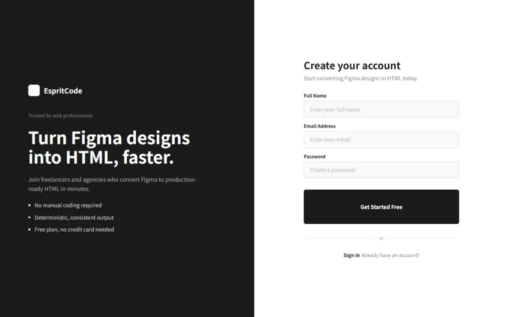
Comparing the two, the two-panel split is preserved: the dark left panel holds its width at 720px with the logo, headline, and feature list correctly stacked, and the right panel centers the form card vertically within the white column. The three input fields retain their border, background color, and placeholder text, and the submit button fills the full width of the form card.
A Look at the Generated Code
The most interesting part to look at is how the form field components are structured. Here’s how EspritCode outputs the Email Address field:
<div class="figma-Field-Email-10-26">
  <p class="figma-Field-Email-Label-10-31">Email Address</p>
  <div class="figma-Field-Email-Input-10-32">
    <p class="figma-Field-Email-Placeholder-10-33">Enter your email</p>
  </div>
</div>
And the matching CSS for the input container:
.figma-Field-Email-Input-10-32 {
  display: flex;
  flex-direction: row;
  align-items: center;
  padding-top: 0px;
  padding-right: 16px;
  padding-bottom: 0px;
  padding-left: 16px;
  width: 100%;
  height: 48px;
  background-color: rgba(249, 249, 249, 1);
  border-radius: 6px;
  border: 1px solid rgb(224, 224, 224);
  box-sizing: border-box;
}
The border from Figma’s stroke property, the background fill, the 16px horizontal padding, the 48px height, and the 6px border radius all carry through accurately. Each of the three form fields follows an identical structure — label above, input container below — which reflects the repeated component pattern in the Figma design.
A few observations on the broader output:
- Class names trace back to Figma. Names like
figma-Field-Email-10-26combine the layer name with the Figma node ID, so you can locate any element in the source design directly from the HTML class name. - The submit button fills full width. The CSS for
figma-SubmitButton-9-13includeswidth: 100%andalign-self: stretch, correctly reflecting the Figma Auto Layout setting where the button stretches to match the form card width. - Small rectangles are output as images. The dot markers in the feature list and the divider lines were output as
<img>tags referencing Figma’s S3 image API, rather than as CSS-styled elements. In production you’d replace these with styled<span>elements or CSS pseudo-elements. - SignInLink order differs from Figma. The “Sign in” text and “Already have an account?” text appear in reversed order in the HTML output compared to the Figma layer order. The visual result is still correct because of the Flexbox row layout, but it’s worth verifying the reading order for accessibility purposes.
What Worked Well
- The two-panel split converted correctly. Both panels are output as
position: absoluteelements — left panel atleft: 0, right panel atleft: 720px— each filling the full 900px height. The split holds exactly as designed. - Form field borders and padding came through accurately. The 1px border, the
#F9F9F9background, the 16px side padding, and the 48px height all match the Figma design values. - The submit button stretch behavior was preserved. The full-width button with centered label converted cleanly, including the
align-self: stretchproperty that makes it fill the form card width. - The form card is vertically centered. The right panel uses
justify-content: centerandalign-items: center, correctly centering the form card within the 900px column height.
Things to Refine After Conversion
As with previous examples, the output is a structured starting point, not a finished deliverable. A few things to address before shipping:
- Replace div inputs with real form elements. The input containers are currently
<div>elements with placeholder text as<p>tags. Replacing these with actual<input>elements inside a<form>tag is essential for any functional sign-up flow. - Replace image dots with CSS. The feature list dot markers and divider lines are output as
<img>tags. These are better handled as CSS-styled<span>elements or pseudo-elements to avoid unnecessary HTTP requests. - Semantic tags. The navigation-style brand name and CTA text are currently
<p>or<h2>tags. Using a<button>for the submit action and an<a>for the sign-in link would improve both accessibility and keyboard navigation. - Responsive behavior. The design is fixed at 1440px. For tablet and mobile, the two-panel layout typically collapses to a single-column form with the branding hidden or condensed — this requires manual breakpoint work.
- Class name refactoring. Renaming
figma-prefixed classes to something likeauth__inputorbrand-panelmakes the CSS easier to maintain.
None of these are specific to EspritCode — they’re the standard steps for turning a static Figma design into a functional authentication page.
Login Pages in SaaS and Freelance Work
Login and sign-up pages are present in every SaaS product and in many client sites that include user accounts, member areas, or gated content. The split-panel layout with branding on the left and a form on the right is a widely used pattern — you see it in Notion, Linear, Vercel, and most modern SaaS authentication flows.
For freelance work, being able to quickly convert a client’s Figma authentication design to a structured HTML baseline saves time at the start of every project. Rather than rebuilding the layout from scratch, you start with the correct panel widths, spacing, and typography already in place, and move directly to wiring in the actual form logic.
As with dashboard and portfolio work, the deterministic output is useful when the design iterates: if the client adds a “Confirm Password” field or a “Sign up with Google” button, reconverting produces a structurally consistent result that’s easy to integrate with existing edits.
Try It Yourself
Want to test your own login page or authentication UI? The Free plan includes 3 conversions per month — no credit card required — so you can compare your Figma file with the generated HTML before committing to anything.