
Converting an account settings page from Figma to HTML usually means rebuilding a sidebar navigation, labeled form fields with different states, a save button, and a destructive action area — all by hand. In this example, I tested how EspritCode handles a realistic SaaS settings UI. I then reviewed the generated HTML and CSS against the original Figma file.
This is the sixth article in my Figma-to-HTML conversion series. So far, I’ve covered a landing page, pricing page, SaaS dashboard, portfolio site, and login page. For this example, I wanted to test a UI pattern that’s present in every SaaS product: the account settings page. Settings pages combine a sidebar navigation, editable and read-only form fields, a save action, and a destructive action area. As a result, they’re a practical test of how a conversion tool handles real admin UI work.
This article shares the actual before and after, with real code snippets from the generated output.
The Figma Design
The page uses a two-panel layout at 1440 × 900px. On the left, a 240px sidebar contains the settings title and four navigation items. The active item (“Profile”) appears in a dark filled state. On the right, the main content area contains a page header, a “Personal Information” card, and a “Danger Zone” card.
The Personal Information card includes two side-by-side name fields and a read-only email field below them. The Danger Zone card contains a delete account button and warning text.
Here’s the full Figma design:
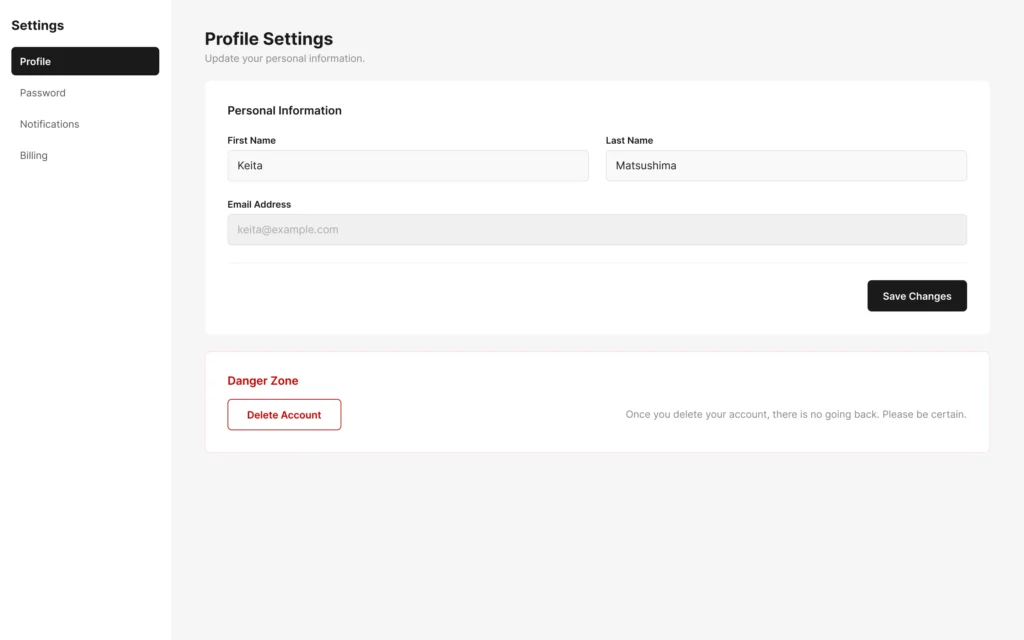
A few intentional design decisions are worth noting. First, the email field uses a darker background and lighter text color to signal that it’s read-only. Second, the save button is right-aligned within the card footer. Third, the Danger Zone card uses a red border to visually separate it from the profile card above.
The Conversion Process
The workflow is the same as in previous examples: paste the Figma URL into EspritCode, wait a few seconds, then download the generated HTML and CSS. No prompting or parameter tuning is required.
The conversion finished in well under a minute.
If you’d like to see other examples first, see the Landing Page, Pricing Page, SaaS Dashboard, Portfolio Site, or Login & Sign Up Page conversion examples.
Why Settings Pages Are a Useful Test Case
Settings pages are worth testing separately from dashboards and landing pages. In short, they introduce UI patterns that don’t usually appear together elsewhere:
- A sidebar with active and inactive navigation states using different background colors and font weights
- A two-column form row with side-by-side fields of equal width
- A read-only field with a visually distinct background and text color
- A right-aligned save button inside a card footer
- A destructive action area (Danger Zone) using a red border and button to signal risk
These patterns show up in almost every SaaS product. For example, active/inactive states, mixed editable and read-only inputs, and danger zones are all standard admin UI conventions. If a conversion tool handles them correctly, it’s likely ready for real admin UI work.
The Result
Here’s the converted HTML rendered in the browser:
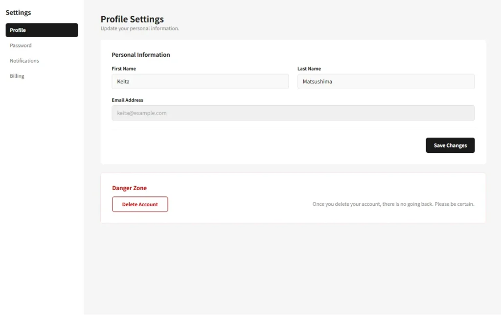
Comparing the two, the layout holds together well. The sidebar sits at 240px on the left, with the active Profile item in its dark filled state. The main content area shows the correct gray background. In the Personal Information card, both name fields appear side by side, and the email field renders in its read-only style below. The Save Changes button is right-aligned in the card footer. Finally, the Danger Zone card renders with its red border, correctly colored title, and outlined delete button.
A Look at the Generated Code
The most interesting parts to examine are the active navigation state and the read-only email field. Here’s the active sidebar item:
<div class="figma-NavItem-Profile-3-6">
  <p class="figma-NavItem-Profile-Label-3-7">Profile</p>
</div>
.figma-NavItem-Profile-3-6 {
display: flex;
flex-direction: row;
align-items: center;
padding-right: 12px;
padding-left: 12px;
width: 100%;
height: 40px;
background-color: rgba(26, 26, 26, 1);
border-radius: 6px;
}
.figma-NavItem-Profile-Label-3-7 {
color: rgba(255, 255, 255, 1);
font-size: 14px;
font-weight: 600;
}In contrast, here’s an inactive item:
.figma-NavItem-Password-3-8 {
  display: flex;
  flex-direction: row;
  align-items: center;
  width: 100%;
  height: 40px;
  border-radius: 6px;
}

.figma-NavItem-Password-Label-3-9 {
  color: rgba(85, 85, 85, 1);
  font-size: 14px;
  font-weight: 400;
}
The active/inactive distinction maps directly from the Figma layer properties to CSS. Specifically, dark background vs no background, and white SemiBold text vs gray Regular text — all without any manual adjustment.
Here’s how the read-only email field is handled:
.figma-Field-Email-Input-6-33 {
  background-color: rgba(240, 240, 240, 1);
  border: 1px solid rgb(224, 224, 224);
  height: 44px;
}

.figma-Field-Email-Value-6-34 {
  color: rgba(170, 170, 170, 1);
  font-size: 15px;
}
The darker background (rgba(240,240,240,1) vs rgba(249,249,249,1) for editable fields) and lighter text color accurately reflect the read-only treatment from the Figma design.
A few additional observations on the broader output:
- Class names trace back to Figma. Names like
figma-NavItem-Profile-3-6combine the layer name with the Figma node ID. As a result, you can locate any element in the source design directly from the HTML class name. - The Save Changes button is right-aligned. The CardFooter uses
justify-content: flex-end, which correctly reflects the Figma Auto Layout setting. - The Danger Zone card border came through. The red border appears correctly on the card container, giving the destructive action area its intended visual weight.
- The Divider Line was output as an image. The horizontal rule between the form fields and the card footer was output as an
<img>tag. In production, this would be replaced with a simple CSS rule.
What Worked Well
- Active and inactive nav states converted correctly. Both the dark filled active state and the transparent inactive state came through without any manual intervention.
- Side-by-side form fields held their layout. The two 508px fields in a Flexbox row converted cleanly, with equal widths and correct internal padding.
- Read-only field styling was preserved. The email field’s distinct background and text color accurately signal its non-editable state in the rendered output.
- The Danger Zone card rendered correctly. The red border, red title, red-bordered delete button, and warning text all came through as designed.
Things to Refine After Conversion
As with previous examples, the output is a structured starting point rather than a finished deliverable. Here are the main things to address before shipping:
- Replace div inputs with real form elements. The input containers are
<div>elements with value text as<p>tags. For example, replacing these with<input>elements — and addingreadonlyto the email field — is required for a functional settings form. - Replace the divider image with a CSS rule. The horizontal divider is currently an
<img>tag. Instead, a simpleborder-top: 1px solid #F0F0F0or an<hr>element would be cleaner. - Semantic tags. The Save Changes and Delete Account buttons are currently
<div>elements. In addition, the sidebar nav items would benefit from<nav>and<a>tags. Together, these changes improve both accessibility and keyboard navigation. - Responsive behavior. The design is fixed at 1440px. On smaller screens, the sidebar typically collapses to a tab bar or dropdown — this requires manual breakpoint work.
- Class name refactoring. Renaming
figma-prefixed classes to something likesettings__nav-itemmakes the CSS easier to maintain long-term.
None of these are specific to EspritCode. They’re the standard steps for turning any static Figma design into a working settings page.
Settings Pages in SaaS Work
Account settings pages are present in every SaaS product. Moreover, they’re one of the most frequently updated screens in a product lifecycle — new fields are added, billing sections expand, and notification preferences grow over time.
Having a clean HTML baseline from the start means each iteration can be reconverted and diffed against existing edits, rather than rebuilt manually. For freelance work, settings pages often arrive alongside a dashboard as part of the same deliverable. Being able to convert both from Figma in the same workflow keeps the project moving efficiently.
The deterministic output is particularly useful here. Because EspritCode produces the same class structure on each conversion, adding a new field to the Figma design and reconverting gives you output that’s structurally consistent with the previous version — and easy to integrate without a full rebuild.
Try It Yourself
Want to test your own settings page or admin UI? The Free plan includes 3 conversions per month — no credit card required — so you can compare your Figma file with the generated HTML before committing to anything.