
Converting a pricing comparison table from Figma to HTML usually means carefully rebuilding a multi-column grid, repeated feature rows, a highlighted plan column, and CTA buttons — all by hand. In this example, I tested how EspritCode handles a realistic three-plan comparison table and reviewed the generated HTML and CSS against the original Figma file.
This is the eighth article in my Figma-to-HTML conversion series. So far, I’ve covered a landing page, pricing page, SaaS dashboard, portfolio site, login page, settings page, and kanban board. For this example, I wanted to test a UI pattern that appears in almost every SaaS product: the pricing comparison table. Unlike a simple pricing card layout, a comparison table introduces a strict grid structure where every row must align across four columns simultaneously. As a result, it’s one of the more demanding layout patterns for a Figma-to-HTML tool to handle correctly.
This article shares the actual before and after, with real code snippets from the generated output.
The Figma Design
The design uses a 1440 × 960px layout. A centered page header contains the title “Compare Plans” and a subtitle. Below it, the comparison table is divided into three sections: a header row with plan names and prices, a body with eight feature rows, and a footer row with CTA buttons.
The three plans are Free ($0/month), Pro ($25/month), and Agency ($80/month). The Pro column is visually highlighted with a dark background (#1A1A1A) and a “Most Popular” badge. The body rows alternate between white and light gray backgrounds, and the Pro column uses darker backgrounds to maintain contrast throughout. Feature values include text values (“3 / month”, “50 / month”), checkmarks (✓), and dashes (—).
Here’s the full Figma design:
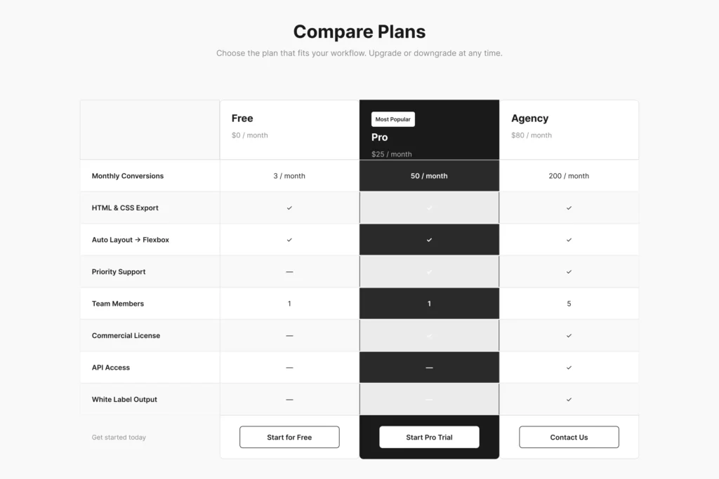
The layout presents an intentional visual hierarchy: the Pro column stands out against the neutral Free and Agency columns, and the “Most Popular” badge and white CTA button in the Pro footer reinforce the preferred plan without requiring any interaction.
The Conversion Process
The workflow is the same as in previous examples: paste the Figma URL into EspritCode, wait a few seconds, then download the generated HTML and CSS. No prompting or parameter tuning is required.
The conversion finished in well under a minute.
If you’d like to see other examples first, see the Landing Page, Pricing Page, SaaS Dashboard, Portfolio Site, Login & Sign Up Page, Settings Page, or Kanban Board conversion examples.
Why Pricing Comparison Tables Are a Useful Test Case
Pricing comparison tables are worth testing separately from simple pricing card layouts because they introduce structural challenges that don’t appear in single-column designs:
- A strict four-column grid where every row must align across feature label, Free, Pro, and Agency columns simultaneously
- A highlighted center column (Pro) that maintains visual distinction across all eight body rows and the header and footer
- Alternating row backgrounds (white / light gray) combined with column-specific backgrounds for the Pro column
- Mixed cell content — text values, checkmarks, and dashes — within the same repeated row structure
- A footer row with three different CTA button styles: outlined for Free and Agency, filled white for Pro
For example, a tool that handles simple card grids well may still struggle with the strict column alignment required in a comparison table. In addition, maintaining the Pro column’s dark background across alternating row backgrounds adds a layer of complexity that tests how accurately background colors carry through the conversion.
The Result
Here’s the converted HTML rendered in the browser:
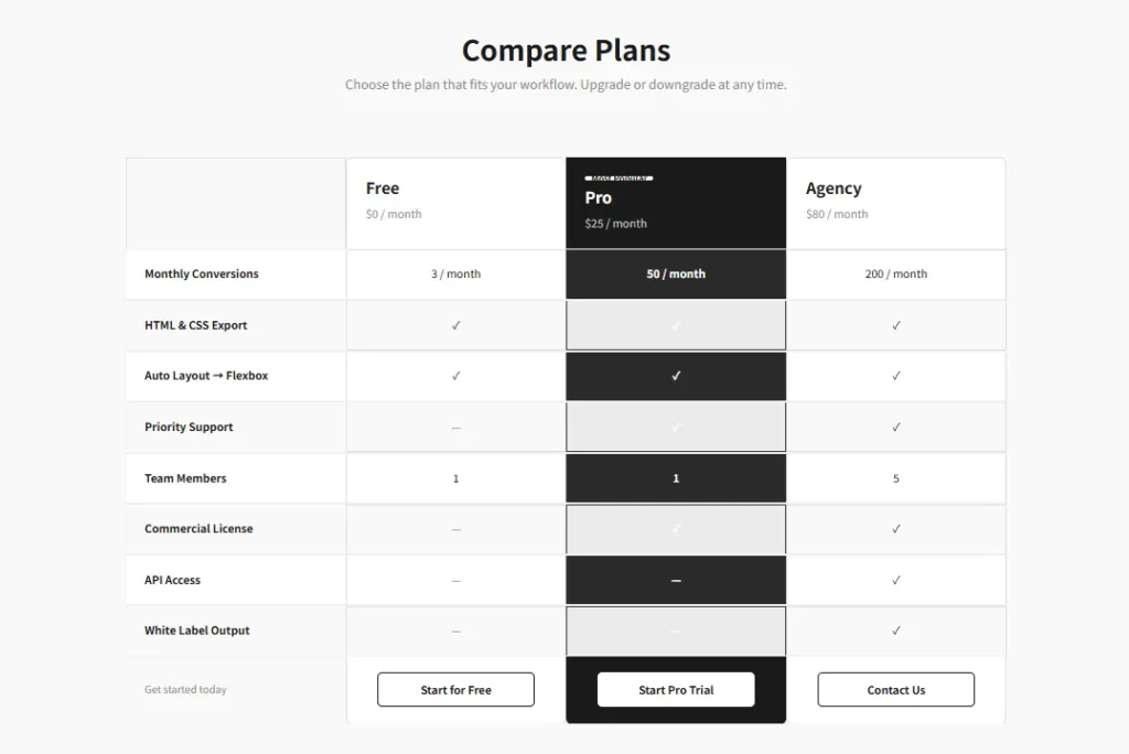
Comparing the two, the table structure holds together well. The four-column grid aligns correctly across all eight rows, the Pro column maintains its dark background throughout, the alternating row backgrounds are preserved, and the three CTA buttons in the footer render with their correct styles — outlined for Free and Agency, white-filled for Pro.
A Look at the Generated Code
The most interesting part to examine is how the repeated row structure is handled. Here’s the HTML for Row-1 (Monthly Conversions):
<div class="figma-Row-1-5-30">
  <div class="figma-Cell-Feature-1-5-22">
    <p class="figma-Cell-Feature-1-Label-5-26">Monthly Conversions</p>
  </div>
  <div class="figma-Cell-Free-1-5-23">
    <p class="figma-Cell-Free-1-Label-5-27">3 / month</p>
  </div>
  <div class="figma-Cell-Pro-1-5-24">
    <p class="figma-Cell-Pro-1-Label-5-28">50 / month</p>
  </div>
  <div class="figma-Cell-Agency-1-5-25">
    <p class="figma-Cell-Agency-1-Label-5-29">200 / month</p>
  </div>
</div>
Each of the eight rows follows this identical four-cell structure. In addition, here’s how the Pro column header is structured, including the “Most Popular” badge:
<div class="figma-HeaderCell-Pro-3-10">
  <div class="figma-Pro-Badge-3-17">
    <p class="figma-Pro-Badge-Label-3-18">Most Popular</p>
  </div>
  <h2 class="figma-Pro-PlanName-3-19">Pro</h2>
  <p class="figma-Pro-Price-3-20">$25 / month</p>
</div>
A few observations on the broader output:
- Class names encode both row and cell identity. Names like
figma-Cell-Pro-1-5-24combine the column name, row number, and Figma node IDs. As a result, every cell can be traced back to its exact position in the source design. - The page title was inferred as h1. “Compare Plans” was output as an
<h1>tag, and the plan names (Free, Pro, Agency) were output as<h2>tags. This reflects the typography hierarchy in the Figma design — the heading inference is based on font size and weight. - Checkmarks and dashes are output as text characters. The ✓ and — values were output as plain text inside
<p>tags. This is straightforward to style with CSS and means no additional image requests are needed for these elements. - The Pro column background alternates correctly. The dark background of the Pro column switches between deeper and lighter dark values across odd and even rows, correctly reflecting the alternating row design from Figma.
What Worked Well
- The four-column grid aligned correctly across all rows. Every cell in every row maintains its column width, and the feature label column, Free column, Pro column, and Agency column all line up consistently from header through footer.
- The Pro column highlight carried through. The dark background of the Pro column header, body rows, and footer cell all converted correctly, maintaining the visual distinction of the highlighted plan throughout the table.
- The “Most Popular” badge rendered correctly. The badge container, background color, and label text all came through as designed within the Pro header cell.
- The CTA button styles differentiated correctly. The outlined style for Free and Agency, and the white-filled style for Pro, both converted accurately from the Figma footer cells.
Things to Refine After Conversion
As with previous examples, the output is a structured starting point rather than a finished deliverable. Here are the main things to address before shipping:
- Replace div buttons with real elements. The CTA buttons are currently
<div>elements. Replacing them with<a>or<button>tags with the appropriate href values makes them functional and improves accessibility. - Style checkmarks and dashes. The ✓ and — characters are plain text in
<p>tags. Adding color styling — green for checkmarks, gray for dashes — makes the table easier to scan at a glance. - Responsive behavior. The design is fixed at 1440px. On tablet and mobile, comparison tables typically collapse to a single-plan view with a plan switcher, or scroll horizontally. This requires manual breakpoint work.
- Semantic table markup. The output uses nested
<div>elements for the grid. For accessibility, replacing this with actual<table>,<thead>,<tbody>, and<th>elements would improve screen reader support considerably. - Class name refactoring. Renaming
figma-prefixed classes to something likepricing__roworplan-cell--promakes the CSS easier to maintain long-term.
None of these are specific to EspritCode. They’re the standard steps for turning a static Figma design into a production-ready pricing table.
Pricing Comparison Tables in SaaS Work
Pricing comparison tables are present in almost every SaaS product. Moreover, they’re one of the highest-stakes UI components on a marketing site — the layout directly affects which plan a visitor chooses and whether they convert at all. The visual emphasis on a recommended plan, the clarity of the feature matrix, and the CTA button placement all influence conversion behavior.
For freelance work, comparison tables often accompany a full SaaS marketing site build. In that context, starting from a structured HTML baseline — with correct column alignment, alternating row backgrounds, and highlighted plan styling already in place — means the development work can focus on wiring in real pricing data and adding interactive behavior rather than rebuilding the grid from scratch.
The deterministic output is particularly useful here. Because EspritCode produces the same class structure on each conversion, updating the pricing table in Figma — adding a new feature row, changing plan prices, or adjusting the highlighted column — and reconverting gives you output that’s structurally consistent with the previous version and straightforward to integrate.
Try It Yourself
Want to test your own pricing comparison table or SaaS marketing UI? The Free plan includes 3 conversions per month — no credit card required. Don’t have a Figma file yet? After signing up, you can use EspritCode’s sample files — a Dashboard and a Portfolio design — to run your first conversion right away.