
Converting a data table from Figma to HTML usually means carefully rebuilding a multi-column grid, repeated row components, color-coded badge variants, avatar placeholders, and pagination controls — all by hand. In this example, I tested how EspritCode handles a realistic user management table and reviewed the generated HTML and CSS against the original Figma file.
This is the ninth article in my Figma-to-HTML conversion series. So far, I’ve covered a landing page, pricing page, SaaS dashboard, portfolio site, login page, settings page, kanban board, and pricing comparison table. For this example, I wanted to test a UI pattern that’s central to almost every SaaS admin panel: the data table. Data tables combine a strict column grid, repeated row components, multiple badge color variants, small icon elements, and pagination — all in a single view. As a result, they’re one of the most practical tests of what a Figma-to-HTML tool can handle.
This article shares the actual before and after, with real code snippets from the generated output.
The Figma Design
The design uses a 1440 × 900px layout. A white header at the top contains the page title (“User Management”), a user count, a search box, and an “+ Invite User” button. Below the header, a white card on a gray background holds the full table: a header row with seven columns (Checkbox, Name, Email, Role, Status, Joined, Actions), five data rows, and a footer with pagination controls.
Each data row includes a checkbox, an avatar placeholder with the user’s name and username below it, an email address, a Role badge, a Status badge, a join date, and a three-dot action menu. The Role column uses three badge variants — Admin (blue), Editor (purple), Viewer (gray) — and the Status column uses three badge variants — Active (green), Inactive (gray), Pending (yellow).
Here’s the full Figma design:
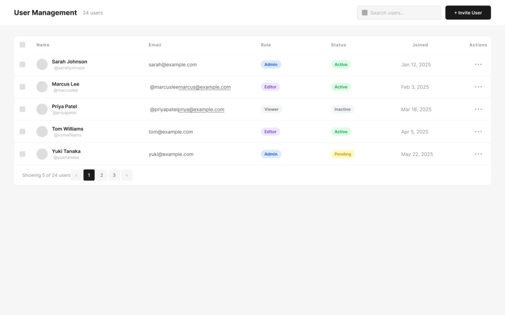
The column widths are carefully sized so they total exactly 1360px — matching the TableCard width — with no gap or overflow. Checkbox is 48px, Name is 320px, Email is 320px, Role is 200px, Status is 200px, Joined is 200px, and Actions is 72px.
The Conversion Process
The workflow is the same as in previous examples: paste the Figma URL into EspritCode, wait a few seconds, then download the generated HTML and CSS. No prompting or parameter tuning is required.
The conversion finished in well under a minute.
If you’d like to see other examples first, see the Landing Page, Pricing Page, SaaS Dashboard, Portfolio Site, Login & Sign Up Page, Settings Page, Kanban Board, or Pricing Comparison Table conversion examples.
Why Data Tables Are a Useful Test Case
Data tables are worth testing separately from dashboards and settings pages because they combine several patterns simultaneously:
- A seven-column grid where every row must align precisely across all columns
- A name cell with a circular avatar, a primary name, and a secondary username stacked in two lines
- Two sets of badge color variants in the same table — Role (Admin, Editor, Viewer) and Status (Active, Inactive, Pending)
- Small repeated icon elements (three-dot action menu) that appear identically in every row
- A table footer with left-aligned info text and right-aligned pagination controls
Together, these patterns represent the kind of admin UI that appears in user management screens, order lists, customer dashboards, and audit logs across SaaS products. For example, if a tool handles the badge color variants correctly across all five rows, it’s likely ready for real admin panel work.
The Result
Here’s the converted HTML rendered in the browser:
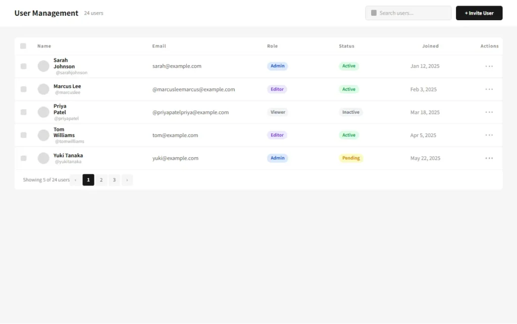
Comparing the two, the table structure holds together well. The seven-column grid aligns correctly across all five rows, all six badge color variants (three Role, three Status) render with their correct background and text colors, the three-dot action icons appear in the Actions column of every row, and the pagination footer shows “Showing 5 of 24 users” on the left with the numbered page buttons on the right.
A Look at the Generated Code
The most interesting part to examine is how the repeated row structure and badge variants are handled. Here’s Row-1 (Sarah Johnson):
<div class="figma-Row-1-15-69">
  <div class="figma-Cell-Checkbox-1-6-47">
    <img class="figma-Checkbox-1-6-49" alt="Checkbox-1" />
  </div>
  <div class="figma-Cell-Name-1-6-48">
    <img class="figma-Avatar-1-6-50" alt="Avatar-1" />
    <div class="figma-NameGroup-1-8-51">
      <p class="figma-Name-1-8-52">Sarah Johnson</p>
      <p class="figma-NameSub-1-8-53">@sarahjohnson</p>
    </div>
  </div>
  <div class="figma-Cell-Email-1-8-54">
    <p class="figma-Email-1-8-55">sarah@example.com</p>
  </div>
  <div class="figma-Cell-Role-1-8-56">
    <div class="figma-RoleBadge-1-8-57">
      <p class="figma-RoleLabel-1-8-58">Admin</p>
    </div>
  </div>
  <div class="figma-Cell-Status-1-8-59">
    <div class="figma-StatusBadge-1-9-60">
      <p class="figma-StatusLabel-1-9-61">Active</p>
    </div>
  </div>
  <div class="figma-Cell-Joined-1-9-62">
    <p class="figma-Joined-1-9-63">Jan 12, 2025</p>
  </div>
  <div class="figma-Cell-Actions-1-9-65">
    <img class="figma-ActionDot-1a-9-66" alt="ActionDot-1a" />
    <img class="figma-ActionDot-1b-9-67" alt="ActionDot-1b" />
    <img class="figma-ActionDot-1c-9-68" alt="ActionDot-1c" />
  </div>
</div>
A few observations on the broader output:
- Badge color variants carried through correctly. Each Role badge and Status badge renders with its correct background and text color — Admin in blue, Editor in purple, Viewer in gray for roles, and Active in green, Inactive in gray, Pending in yellow for statuses. In total, six distinct color combinations are present in the output without any manual adjustment.
- Small rectangles are output as images. The checkbox placeholders, avatar circles, search icon, and three-dot action dots were all output as
<img>tags referencing Figma’s S3 API. This is consistent with how EspritCode handles small filled rectangles throughout the conversion series. In production, these would be replaced with actual form inputs, user avatars, icon fonts, or SVG elements. - The pagination active state converted correctly. Page button 1 renders with a dark background and white text, while buttons 2 and 3 render with a light gray background and dark text — accurately reflecting the active/inactive distinction from the Figma design.
- The table footer uses space-between layout. “Showing 5 of 24 users” sits on the left and the pagination group sits on the right, correctly reflecting the Figma Auto Layout space-between setting as
justify-content: space-betweenin the CSS.
What Worked Well
- The seven-column grid aligned correctly across all rows. Every cell in every row maintains its column width, and the columns line up consistently from the header row through all five data rows and the footer.
- Six badge color variants rendered accurately. Both the Role and Status badge sets converted with correct background colors, text colors, and border radii across all five rows — with no color bleed between variants.
- The name cell two-line structure held together. The avatar, primary name, and secondary username within each name cell maintained their correct relative positions in the output.
- The pagination active state was preserved. The dark-filled active page button and the light inactive buttons converted correctly without any manual CSS adjustment.
Things to Refine After Conversion
As with previous examples, the output is a structured starting point rather than a finished deliverable. Here are the main things to address before shipping:
- Replace image placeholders with real elements. The checkboxes, avatars, search icon, and three-dot action dots are all
<img>tags. In a working admin panel, these would be replaced with actual<input type="checkbox">elements, real user avatar images or initials components, a proper search icon, and a button element for the action menu trigger. - Handle row height for long content. The rows are fixed at 64px. In production, switching to
min-height: 64pxand allowing content to expand prevents truncation when names or email addresses are longer than expected. - Add text overflow handling. Long email addresses or names can overflow their cell containers. Adding
overflow: hidden,text-overflow: ellipsis, andwhite-space: nowrapto cell text elements keeps the layout intact. - Semantic table markup. The output uses nested
<div>elements for the grid. For accessibility, replacing this with actual<table>,<thead>,<tbody>, and<th>elements would improve screen reader support considerably. - Responsive behavior. The design is fixed at 1440px. On smaller screens, data tables typically require horizontal scrolling or a card-based mobile view — this is manual work after conversion.
None of these are specific to EspritCode. They’re the standard steps for turning a static Figma data table into a working admin UI component.
Data Tables in SaaS Work
Data tables are present in virtually every SaaS admin panel. User management, billing history, order lists, team members, audit logs — all of these use the same basic pattern: a column header row, repeating data rows with mixed content types, and a pagination footer. Moreover, they’re among the most frequently updated screens in a SaaS product, as new columns and row types get added as the product evolves.
For freelance work, data tables often arrive as part of a larger admin panel deliverable. In that context, starting from a structured HTML baseline — with correct column widths, badge color variants, and pagination layout already in place — means the development work can focus on wiring in real data and adding sort, filter, and selection behavior rather than rebuilding the grid from scratch.
The deterministic output is particularly useful here. Because EspritCode produces the same class structure on each conversion, adding a new column or row type to the Figma design and reconverting gives you structurally consistent output that’s easy to integrate with existing styles and logic.
Try It Yourself
Want to test your own data table or admin panel UI? The Free plan includes 3 conversions per month — no credit card required. Don’t have a Figma file yet? After signing up, you can use EspritCode’s sample files — a Dashboard and a Portfolio design — to run your first conversion right away.